
EDC Photography:
Part 1: Composition
Series Contents:
-
Introduction
- Part 1: Composition (You’re Here!)
-
Part 2: Lighting
-
Part 3: Color
-
Part 4: Post Processing – Global Adjustments
-
Part 5: Post Processing – Local Adjustments
-
Part 6: Post Processing – HSL
What exactly is composition, you may ask? Simply put, it’s the answer to the question: “What is where in the frame?”. It’s the placing of subjects, or in other words, the layout of the picture.
Do you know the feeling you get when you enter a room so messy that you think to yourself: “Oh god, what happened here?”. Your eyes wander around the room because you don’t know where to look first. The same goes for pictures. If your photo is too cluttered or isn’t framed up nicely, people won’t know where to look and they may miss the purpose of your image.
There are different guidelines as to what is perceived as aesthetically pleasing — the easiest of which being center frame and the rule of thirds.
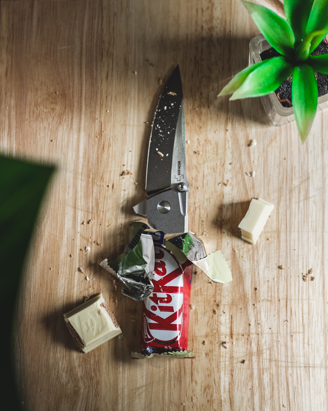
Center Frame
This is pretty self-explanatory. You place the object you want to showcase dead-center in the frame.
Image by @raven_the_pirate
Image by @raven_the_pirate
As humans we tend to prefer symmetry in objects and images. Having the object in the exact middle with equal distances to the border of the image is just visually pleasing.
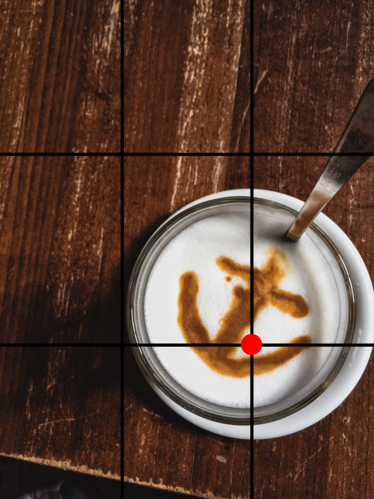
Rule of Thirds
For the rule of thirds, you imagine lines that separate the frame into thirds. Try and place your object along any of those lines or on any cross-section.
Image by @raven_the_pirate
Image by @raven_the_pirate
Image by @raven_the_pirate
Why do these guidelines work? These guidelines make the placing feel intentional as if everything in the frame is meant to be there.
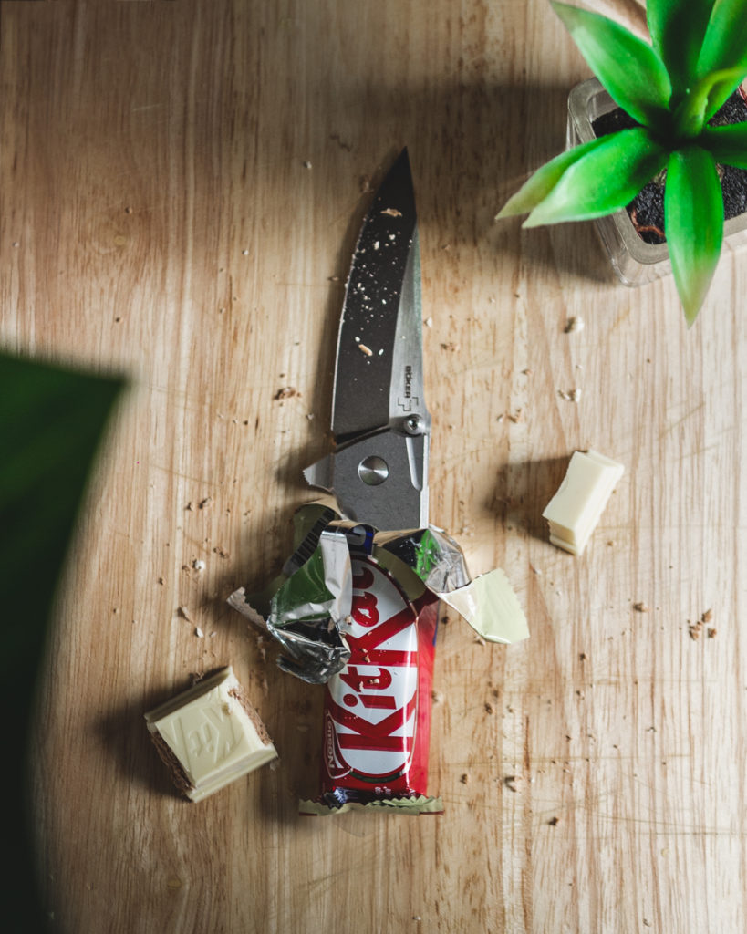
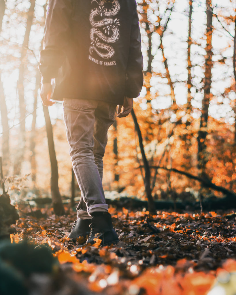
If the knife in the KitKat picture above wasn’t dead center, it would seem like you’ve tried but failed to place it center frame. If the person in the forest picture (who is me, yeah, I’m talking about myself in the third person) were too far left, it would feel like he’s dropping out of frame. It could even look as if you were too slow to capture the picture in time. In any case, the failure to properly compose your subject in the frame could detract from the final photo.
In the end, whether you’re aware of it or not… all these things being a tad off will evoke a slight feeling of uneasiness when we look at images. Being intentional about the placement of subjects in your frame can make a big difference.
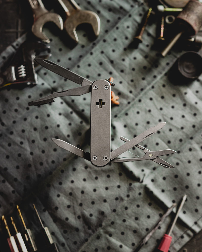
Ok, you placed the objects properly, now what? Just a knife in the middle of a white frame isn’t that interesting to look at (note: there are always exceptions!).
Now it’s time to add interest to your photo. But how do you do that? That depends a little bit on what kind of photo you’re shooting, flatlay or non-flatlay.
Non-Flatlay
Something that will make your photo more interesting is depth.
A great way to add depth is by having a background and foreground. I see it this way: the object you want to showcase should be your main focus, the background sets the scene and gives you an idea where you are, while the foreground will add intimacy and makes you feel like you’re right there.
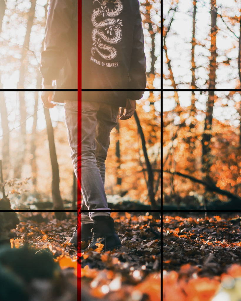
Image by @raven_the_pirate
Image by @raven_the_pirate
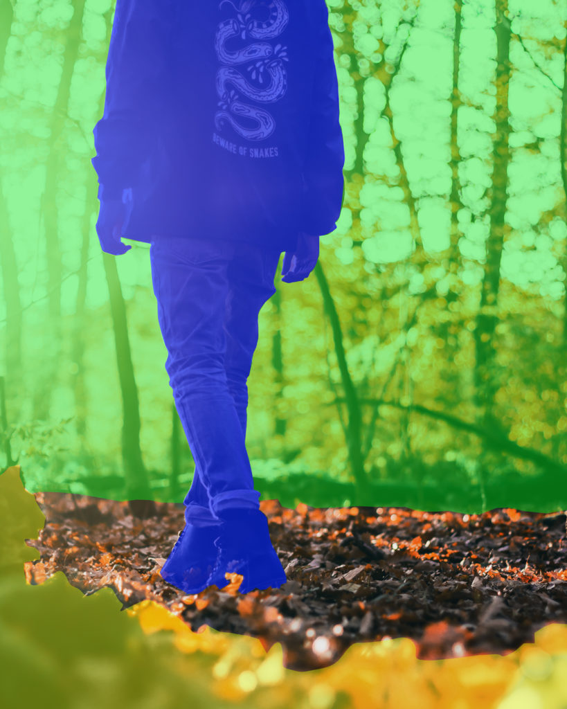
Here the person (still me!) is the main focus. The forest (green highlight) is the background and shows you where we are. It gives you a sense of space and how far away or big things are in comparison.
The little rocks and leaves (yellow highlight) act as the foreground. They make you feel like you’re there in the scene, peeking from behind the rocks.
Depending on your camera and the distance between these different levels of depth, the foreground and background will be more or less blurry. This blur is a neat side effect that will help people focus more on the main subject of the photo.
Additionally, we don’t need to see every leaf in the background or stones in the foreground because they aren’t the focus of the image. So, if something in the frame is too distracting, move it more into the background or closer to the foreground to make it blurrier. Generally, the further away something is from the plane of focus, the blurrier it will get.
Flatlay
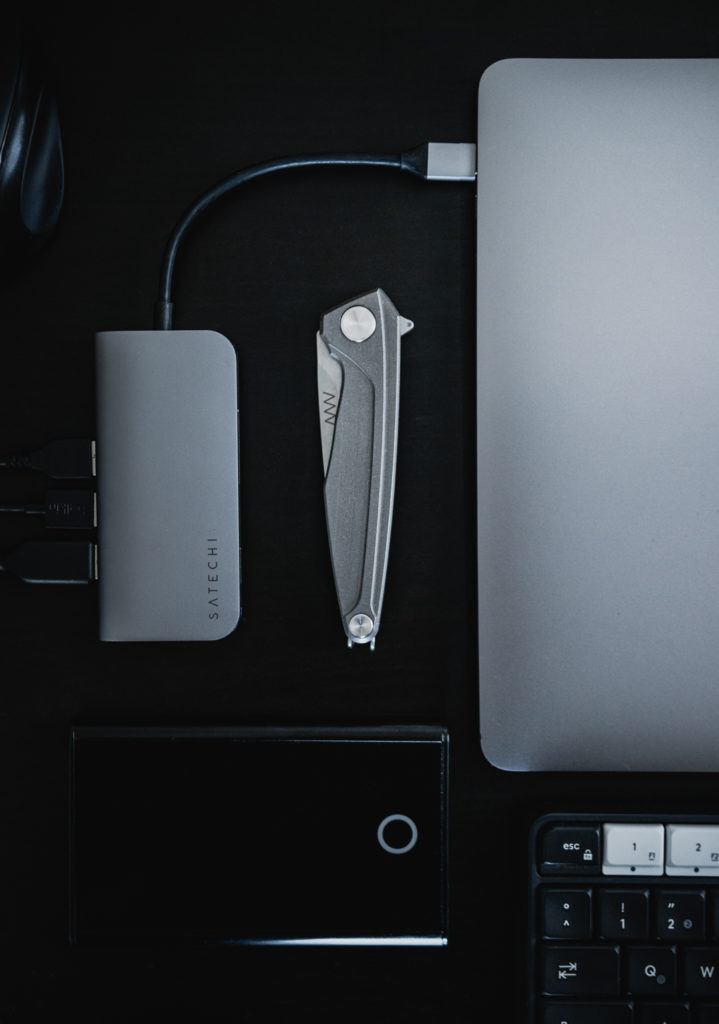
With flatlay photos, you have different options to make the image more interesting. One great way is adding supporting elements.
Try to choose items of similar texture, material or things that will fit in with the theme you are trying to portray.
Image by @raven_the_pirate
Image by @raven_the_pirate
For example on the left photo, my main object is the knife. Because of its clean design and minimal look, I thought it would be cool to have a modern technical theme. So, I added a MacBook and a USB hub of similar color and material to go with the knife. I also added some other objects that fit into that office setup theme.
You want to add things to add mood, to set a scene or to match the theme. Just be careful that your supporting elements don’t take away attention from your main object.
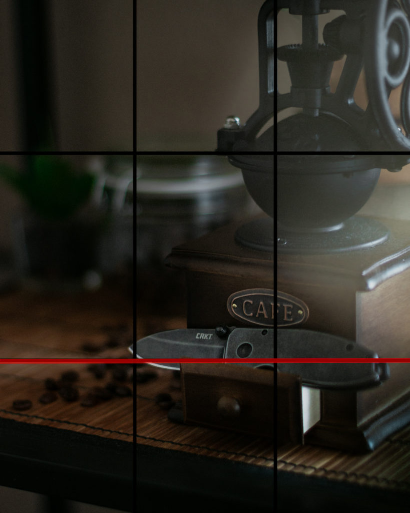
Since a flatlay photo per definition is, well, flat (surprise!) it is difficult to add depth the same way you can with non-flatlay photos. But there are a few ways to force depth… you could create artificial levels of depth by having different objects sit on things of different heights like boxes or tables.
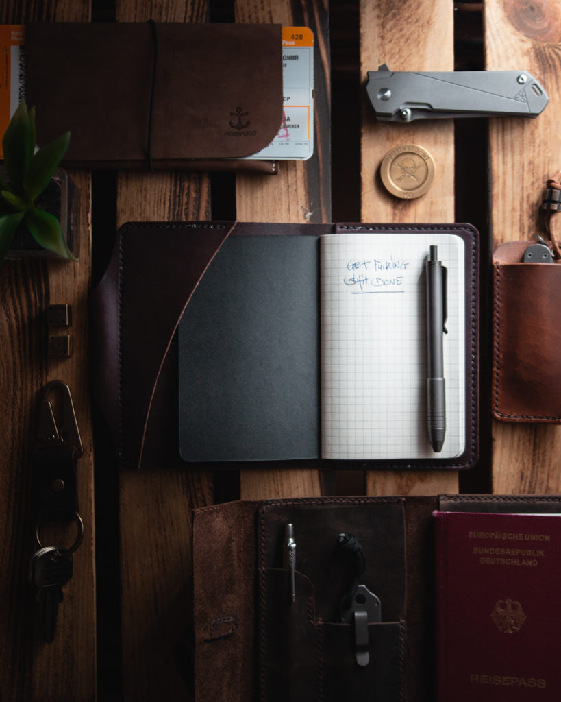
You can also place something right in front of the lens that will act as the foreground. For instance, in that very first photo of the KitKat knife, I had a leaf creep into the frame ever so slightly to add something in the foreground.
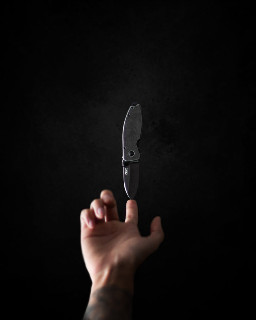
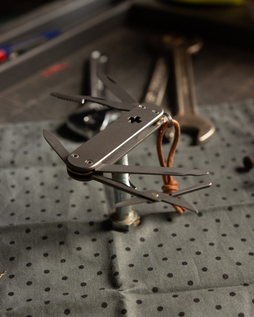
A neat little trick, that is very popular, is having your main object sit on something that will disappear behind it.
Image by @raven_the_pirate
Image by @raven_the_pirate
This trick creates a bit of separation between the main subject and the background which makes the elevated object pop much more. A cool bonus is that this also creates the illusion that the object is floating.
So next time you’re taking out your camera to take a shot, maybe take an extra 30 seconds to think of your composition. Sometimes it’s as easy as moving slightly to the left to have a composition that is so much better.
Here are some IG accounts that absolutely nail composition: @hitchandtimber, @knife_or_die, @button_winter.
Next stop: Lighting!
6 thoughts on “EDC Photography: Part 1 – Composition”