
EDC Photography:
Part 3: Color
Series Contents:
-
Introduction
-
Part 1: Composition
-
Part 2: Lighting
- Part 3: Color (You’re Here!)
-
Part 4: Post Processing – Global Adjustments
-
Part 5: Post Processing – Local Adjustments
-
Part 6: Post Processing – HSL
Everybody has seen one of these images: a black and white photo with only one element in color. Although the artistic value of these pictures is debatable there is no denying that they definitely make you look at the subject. But why is that?
Just like a messy photo feels cluttered, an image that consists of too many different colors feels disorganized and chaotic. Reducing the colors like these black and white photos is one way to deal with the issue. But what if I tell you that you don’t have to get rid of colors? Rather, you only need to choose the right ones.
There are a few different color theories – each of which have different effects and convey different emotions. For this walkthrough, I will cover the two of the most common color schemes: 1, the use of similar colors; and 2, the use of complementary colors.
Using Similar Colors
Going with similar colors is pretty straight-forward: you try to choose elements that all have similar colors.
Image by @raven_the_pirate
Image by @raven_the_pirate
Using similar colors makes the entire image feel more coherent. It ties the different objects together as if they were always meant to be together.
Though, the downside of this scheme is that it’s sometimes hard to tell different objects apart, especially if your main object and the background are too close in color. It can be like wearing camouflage in a forest.
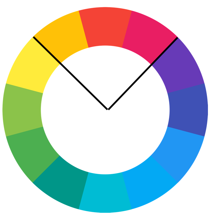
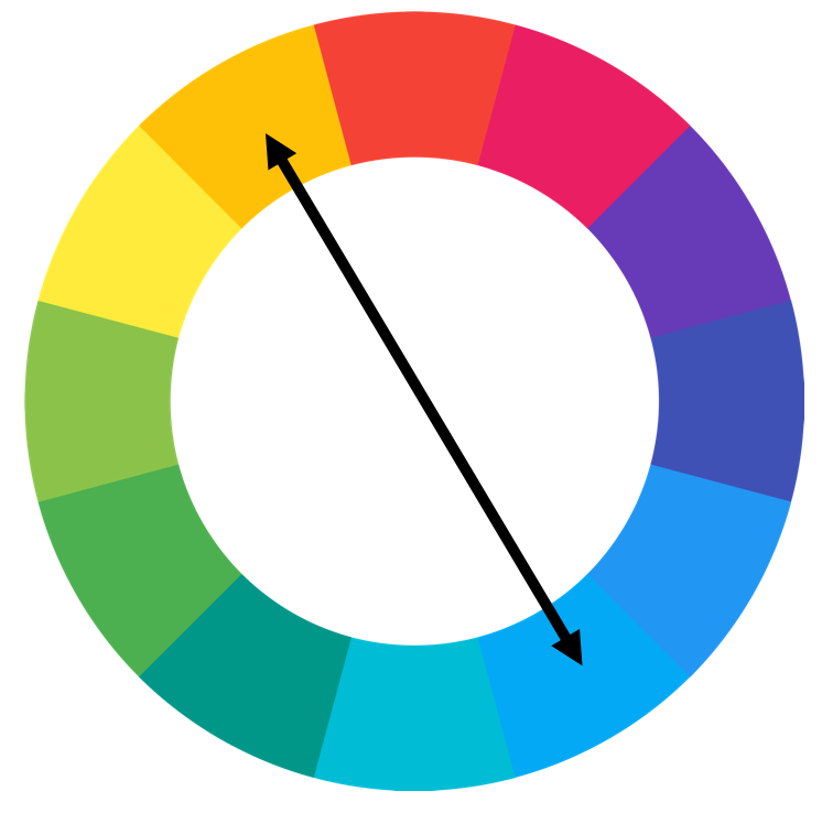
Using Complementary Colors
If you want to create more separation between different objects you may want to try complementary colors. “Compe… what?”. Complementary colors are colors on the opposite side of the color wheel.
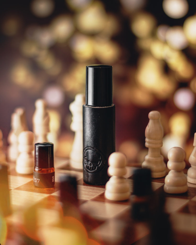
Image by @raven_the_pirate
Image by @raven_the_pirate
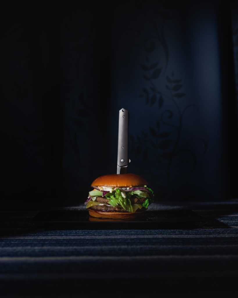
Using complementary colors creates contrast and separation which is similar to how light and shadow techniques (from part 2) create contrast.
If we had used similar colors in the image with the burger then it probably would have felt more coherent and tied together. But in this case by going with a blue background the burger stands out much more. The spotlight enhances this effect even further and makes the burger pop.
Utilizing Hue and Saturation
Up until now, we have used the term “color”. In reality “color” is made up of hue and saturation. By definition, hue is the actual color and saturation is the intensity of said color.

Both these squares are the exact same hue, but the right one is only half as saturated.
Where did your eye go first? Exactly, the left one. The human eye tends to go from the most saturated to the least saturated part of an image. That’s why the black and white images with one colored object work. Black and white is basically no saturation, so your eye automatically goes to the only part of the image that is saturated.
Color theory is one of those things that can seem pretty abstract when you read about it. But once you’ve done it a few times you’ll get a feeling for what works and why.
If you want to look at some IG accounts that use color in very cool ways then these might be worth checking out: @patina.turner_, @lurkersedc.
Next stop: Post-Processing – Global Adjustments
4 thoughts on “EDC Photography: Part 3 – Color”